
Education template
Courses, students and enrolments, with attendance and completion reported per cohort rather than per spreadsheet tab.
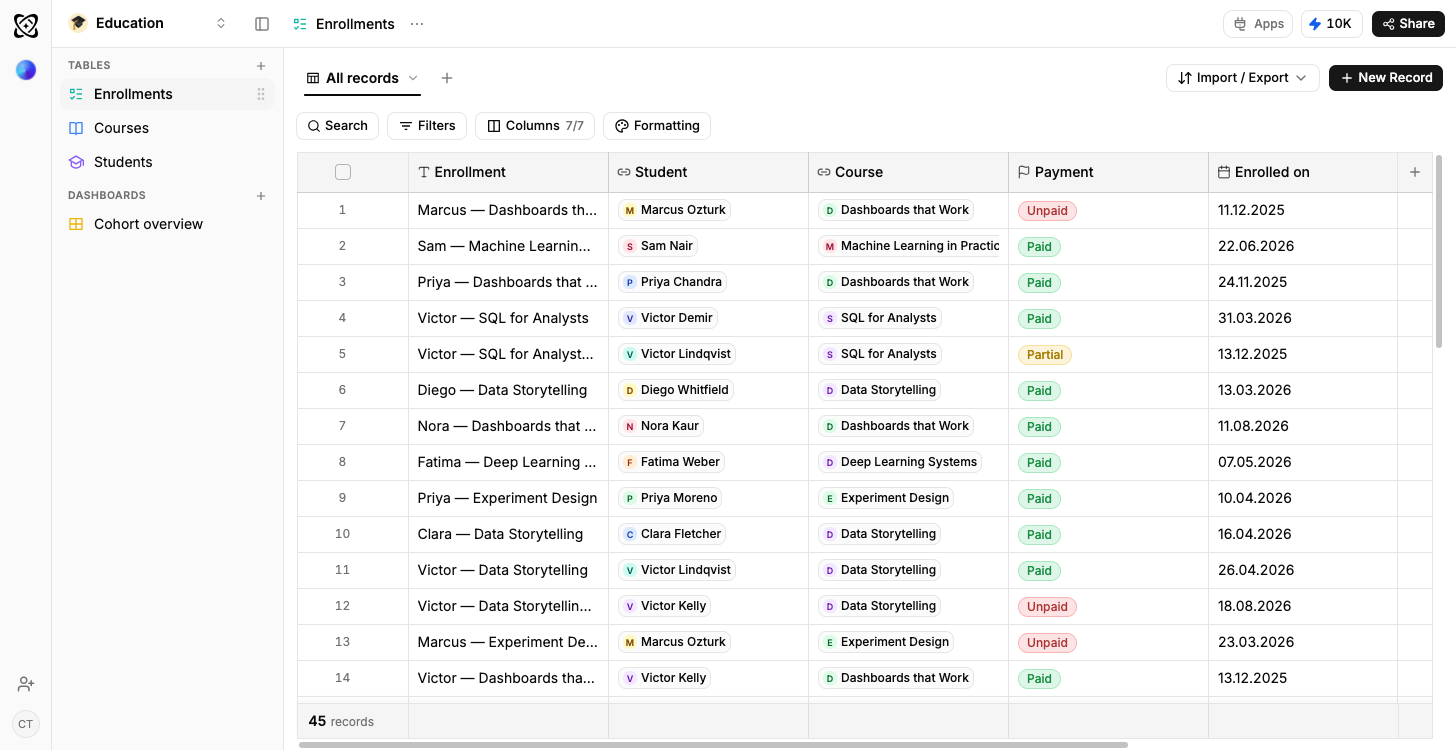
- Linked tables, not tabs
- Relationship columns join the rows instead of copying them into three places.
- Sample rows on arrival
- Every table opens with data in it, so the dashboards draw before yours does.
- Your own data, imported
- CSV, XLSX, a connected Google Sheet, or an email you forward straight in.
- Reshaped by describing it
- Say what is different and Ferra changes the structure and the rows together.
What is a student management template?
Courses, students, and the enrolment that joins each student to each course: three things, not one. Ferra's student management template models that join as its own table: one Enrolments row holds attendance, grade and completion for one student on one course. It arrives working, with sample rows loaded and two dashboards already drawing: attendance by cohort, and completion against capacity.
A course, a student and the enrolment that joins them are three different things, and the moment they live in three tabs of the same spreadsheet, attendance stops being answerable. This template models the join explicitly: an enrolment carries attendance, grade and completion for one student on one course, which is what makes "who is below seventy percent this term" a question with an answer instead of a manual count per tab.
Courses, students, and the row that joins them
Courses holds one row per course per term: name, instructor, term, capacity, session count, start date. The sample row reads Introduction to Statistics, Dr Aliyev, Spring, thirty seats, twelve sessions, starting 3 Feb. Students is one row per person: cohort, email, the date they enrolled, a status, and a Courses taken column that's a formula, not a count somebody keeps. Then there's Enrolments, the table the whole thing turns on. One row is one student on one course, and it carries the attendance percentage, the grade, a completed flag, and the date they last attended.
Why a spreadsheet fails here specifically
Attendance belongs to neither a course nor a student. It's a property of this student on this course, and that's the structural reason the spreadsheet version breaks, no sloppiness required. Give courses one tab and students another and the fact you most want to report on has nowhere to live, so it gets smeared across a row of columns named after weeks. Make the enrolment its own row and “who is below seventy percent attendance this term” collapses from a manual count per tab into a filter.
Reports that end in who to contact
A percentage doesn't tell you who to email. Attendance by cohort does: it charts rates per cohort and per course across the term, then lists every student under the threshold right beneath, so the report ends in names rather than a number. Completion and capacity sets each course's fill against its seats alongside the fraction of enrolments that actually finish it: the view where an oversubscribed course and one quietly losing people no longer share a summary line.
Questions the term throws up
Ask “which students are below seventy percent attendance this term” and you get a list, read straight off the enrolment rows. “Which courses have the lowest completion rate” runs the same rows the other direction. “How full is each course against its capacity” sets an enrolment count against a number already sitting on the course row. The sharpest one uses the last attended date: “who has not attended anything in the past three weeks” finds the student before they become a dropout.
Recording attendance per class
One figure per enrolment summarises a term; it can't reproduce a register. When you need per-class detail, say so: ask for a Sessions table and Ferra restructures the tables around it, carrying the existing rows across instead of handing you a term's worth of registers to re-key. The same route covers assessments and fees, or a second instructor per course: the structure changes together with the rows inside it.
Who it suits
Training providers, language schools, bootcamps, a university department running its own cohorts: anyone tracking enrolments outside a full student information system. And if your institution already runs one? Keep this anyway, for the reporting an SIS makes hard to reach: attendance by cohort and completion by course, no data request filed.
Getting your enrolments in
Order matters: courses first, then students, then enrolments, and each import can be told which columns name the rows it links to. A CSV or XLSX export from your current system drops straight in. Better still, a Google Sheet a coordinator already maintains can stay connected, so the tables keep pace with it instead of drifting away from it within a fortnight.
You may also like
Browse all templates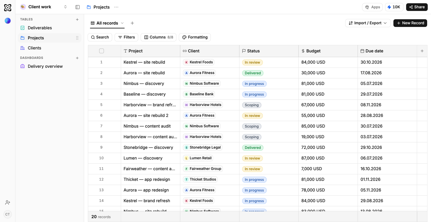
Client work
Due this week; shipped but not billed
Operations
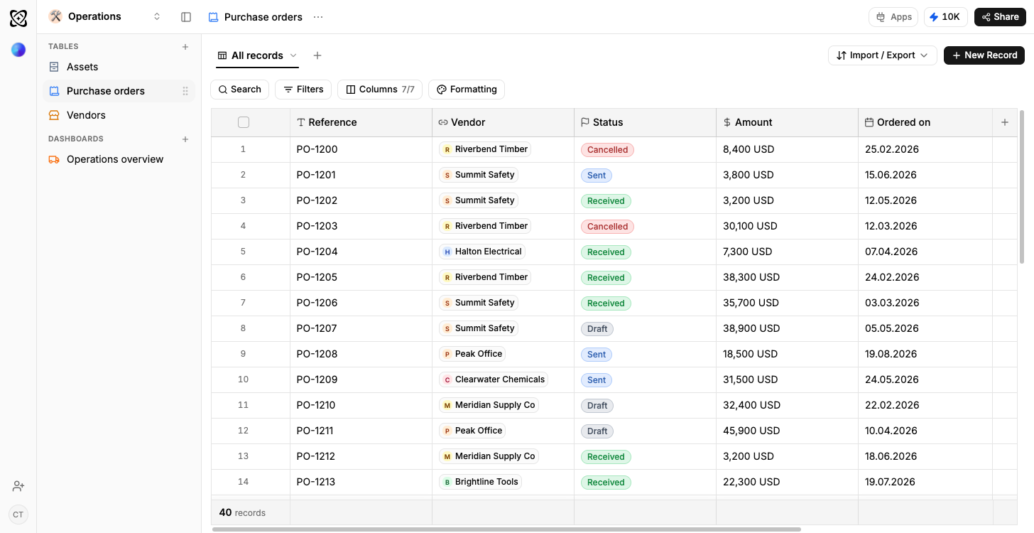
Orders in flight, spend by supplier
Logistics
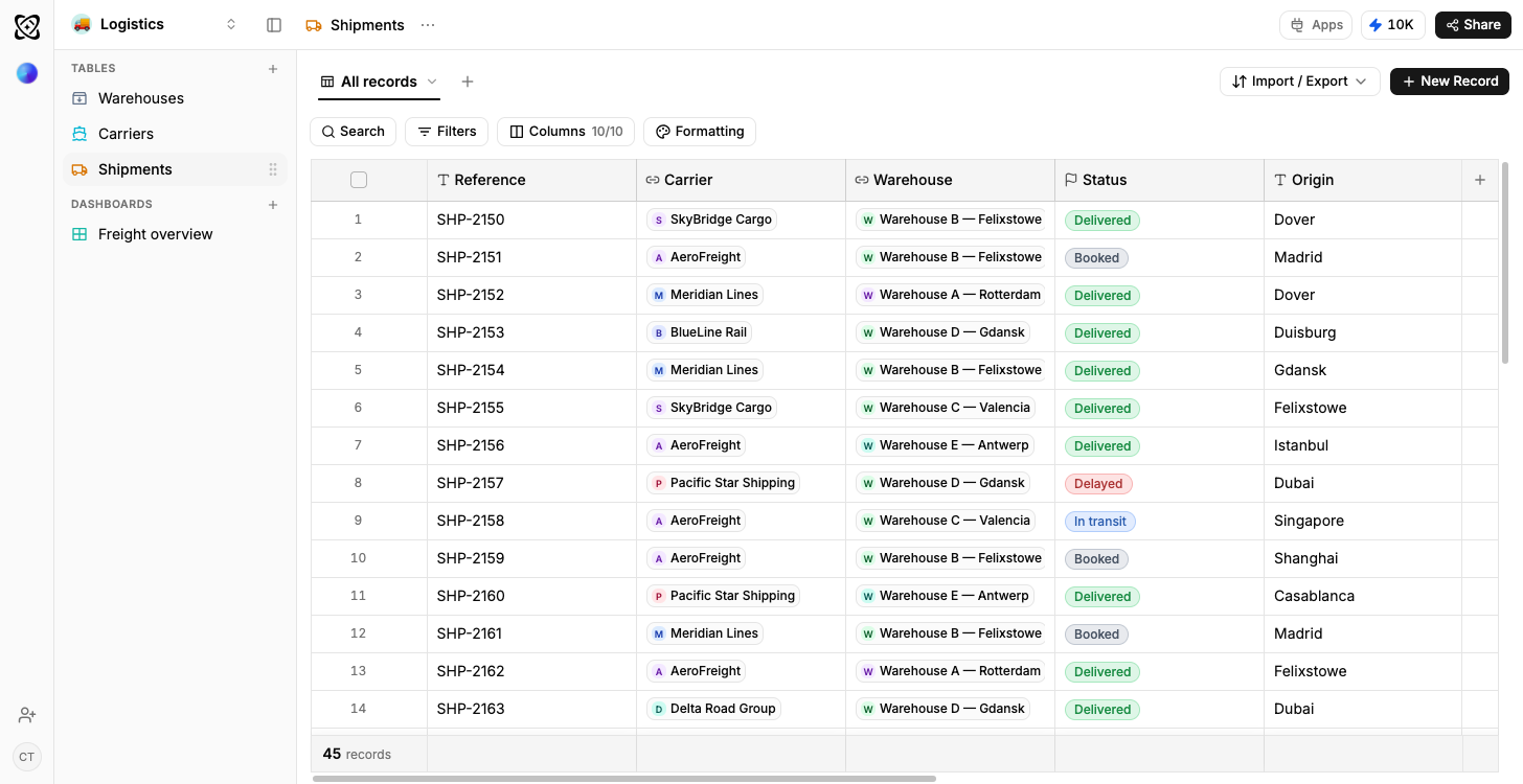
On-time rate by carrier and lane
General workspace
Projects and budget by status
Sales pipeline
Open pipeline by stage, results by owner
Real estate
Portfolio value and leads, by stage
Recruiting
Candidates by stage, openings by status
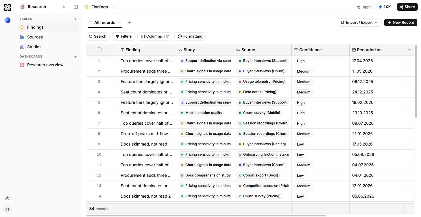
Research
Findings per theme, by confidence and source
Frequently asked questions
The questions people ask before starting from the Education template.
Because attendance belongs to a student on a course, not to either on its own. Giving the join its own row is what makes attendance and completion reportable at all.
Yes. Add a Sessions table and Ferra restructures the tables and carries the existing rows across, so you are not re-entering a term of registers.
No. It covers courses, students, enrolments and the reporting over them, which is often what a department needs without waiting on a data request.
Yes, on the free plan with no credit card, and the sample courses, students and enrolments are in the tables when it opens.
Report on a cohort, not on a spreadsheet tab.
One enrolment holds attendance, grade and completion for one student on one course, which is the row a cohort report is actually built from.
Use template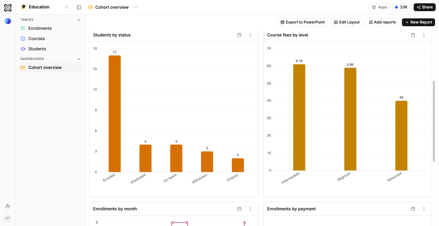
The enrolment is the row that answers things
One student on one course, carrying attendance, grade and completion, which is why “who is below seventy percent” is a filter and not a count per tab.
How relationship columns workA report that ends in who to email
Attendance by cohort lists the students under the threshold beneath the chart, rather than leaving you holding an average.
How a dashboard gets builtThe register the office already keeps
A term of enrolments imports from CSV or XLSX, or stays linked to the Google Sheet somebody updates every week.
How a sheet stays connected