

Facebook page insights template
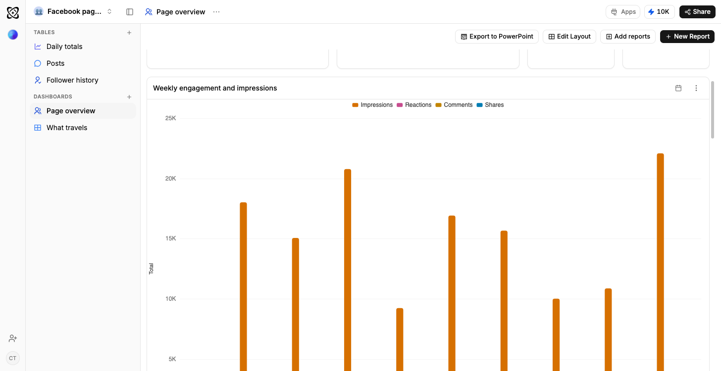
Page posts, reach and reactions over time, with the breakdown of what drove each spike.
- Typed columns, not text
- Dates, numbers, percentages and selects, so a chart draws straight off the rows.
- Sample rows on arrival
- Every table opens with data in it, so the dashboards draw before yours does.
- Your own data, imported
- CSV, XLSX, a connected Google Sheet, or an email you forward straight in.
- Reshaped by describing it
- Say what is different and Ferra changes the structure and the rows together.
What is a Facebook page insights template?
A Facebook page moves on three timescales at once, and this workspace gives each its own table: the posts, the daily reach, and the audience as it shifts over time. Ferra's version arrives with sample rows already in all three tables and two dashboards on top: reach over time with the spikes explained, and what each post type earns.
Page reach moves in spikes, and a spike is only useful if you can say what caused it. This template keeps a row per post with its type and its shares, a row per day of page-level reach and views, and a row per audience snapshot, so the chart and the explanation live in the same workspace. It also makes the slow story visible: whether page likes are actually growing, or being replaced faster than they arrive.
Three tables, three timescales
The fast layer is Posts: one row per post on the page, with the message, the date it went out, the type (Video, Link, Photo), the reach it travelled to, the reactions it collected and the number of shares. The middle layer is Daily page insights, one row per day: page reach, page views, engagements, new likes. The slow layer is Audience, one row per snapshot: page likes, the net change since the last one, the top city and the top age band. Together they cover the three timescales a page actually moves on: the post, the day, and the slow drift of who follows you.
A spike is only useful with a cause attached
The line jumps on the twelfth. Why? Because a row per post sits next to a row per day, the answer is already on the chart: the post published on the twelfth appears right beside the peak, not in a different tab or in an app that has since stopped showing it. Page reach moves in spikes, and a spike you can explain is a spike you can try to repeat.
The slower story the Audience table tells
A decline of twelve in a week hides perfectly inside a running total and is unmissable as a series. That's the case for snapshots: page likes with a net change on every one, so a genuinely growing audience looks different from one being replaced faster than it arrives. Left unnoticed for two quarters, that kind of leak gets expensive. The sample rows include a week where likes went backwards: you'll recognize the shape before it belongs to your page.
Reactions are not shares
Some posts collect reactions and never leave the feed. Others travel. Only the ratio between reactions and shares separates the two, and that ratio only exists once reach, reactions and shares are split by post type. What each post type earns does the splitting: all three numbers side by side with the ratios between them, so you're not working the difference out by eye from a list of posts.
Questions you can type
Type "what drove the spike in reach on the twelfth" and the answer reads the daily row alongside the posts published against it. "Which post type gets shared most often" ranks by the ratio rather than the raw count. "Are page likes growing or leaking, month by month" reads the audience snapshots as a series. And "which posts got reactions but no clicks" is the question that separates a popular post from a useful one.
Adding paid alongside organic
Most pages run paid and organic at the same time, and comparing them from two different reports is exactly how the wrong conclusion gets drawn. Add an Ads table and put paid reach beside organic reach on the same chart. The week that looked strong organically becomes visible for what it was: the week that got boosted. A campaign column, a creative, or a landing page can be added the same way.
Who it suits
Small businesses and nonprofits running their own pages get the most out of it. An agency reporting on a client's page fits too, and so does any marketer who needs a Facebook number that outlives the app's own window. If Facebook is one channel among several, the cross-platform social media analytics template holds them together instead.
Getting the numbers in
One import a month covers it. Facebook arrives through Ferra's social import where your workspace has it enabled, a job you re-run, not a connection that stays open, and everywhere else, Facebook's own export or a Google Sheet you already keep loads the same tables today. One boundary: Meta Ads has no Ferra connector, so campaign cost stays out of this template. A monthly refresh keeps the daily and audience rows current, and current rows are all the two dashboards run on.
You may also like
Browse all templates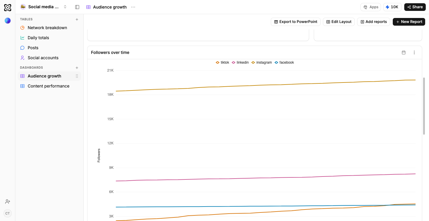
- TikTok
- YouTube
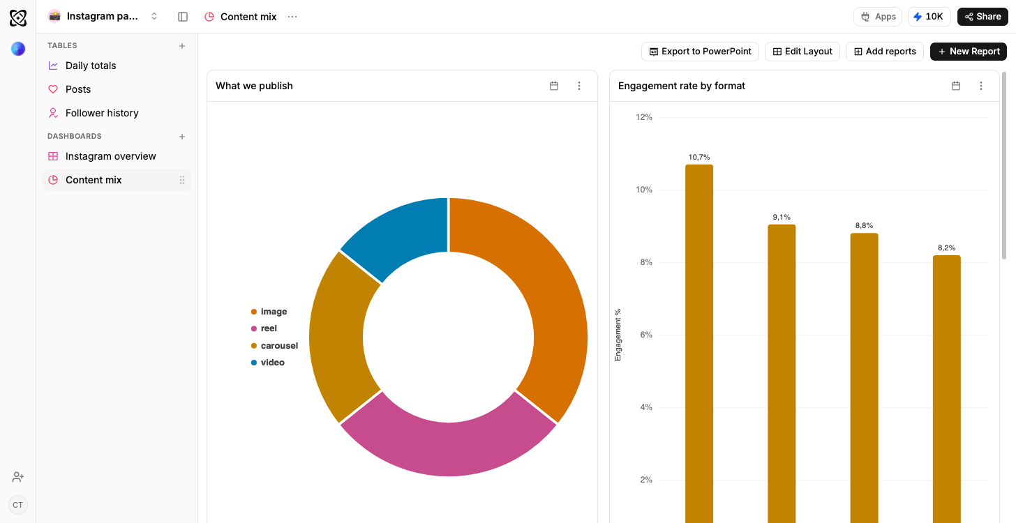
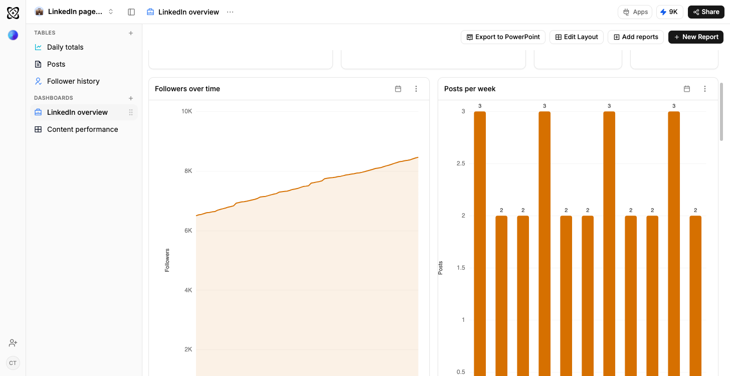
Social media analytics
Every channel compared, and what works where
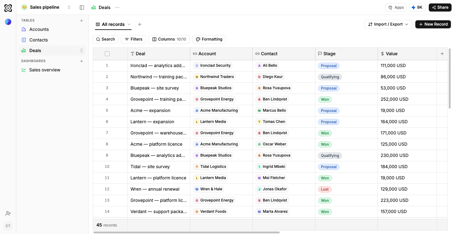
Sales pipeline
Open pipeline by stage, results by owner
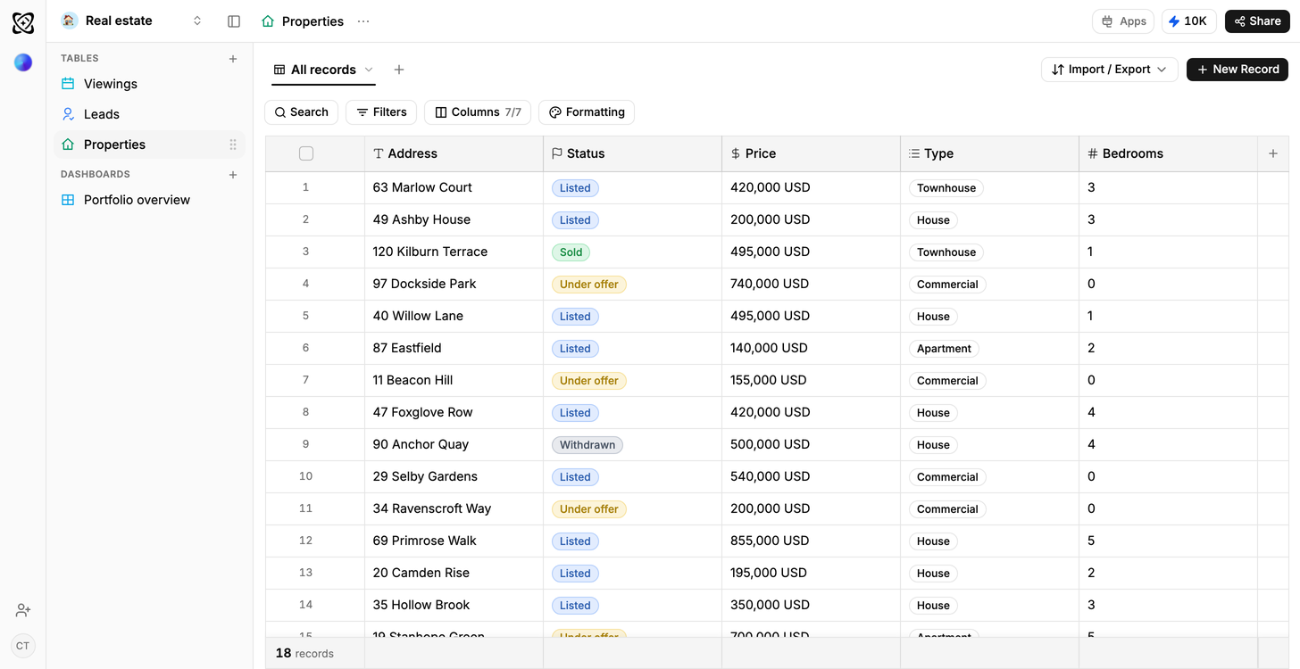
Real estate
Portfolio value and leads, by stage
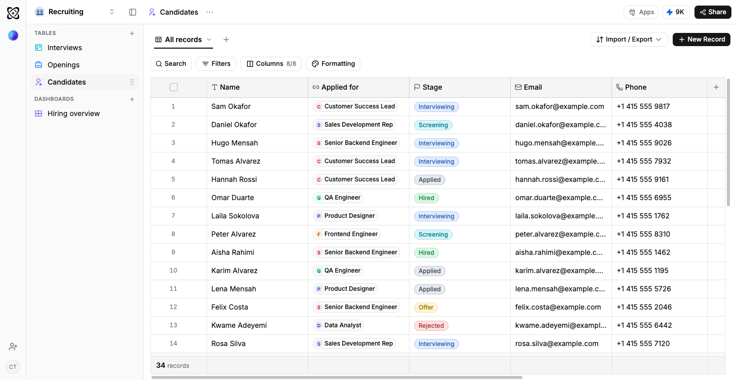
Recruiting
Candidates by stage, openings by status
Client work
Due this week; shipped but not billed




Frequently asked questions
The questions people ask before starting from the Facebook page insights template.
Facebook, yes: through Ferra’s social import, where your workspace has it enabled. Meta Ads, no: there is no Ferra connector to the ad platform, so campaign cost stays out of this. Without the social import, Facebook’s own export or a connected Google Sheet reads into these tables.
Yes. Reach over time plots daily page reach with the posts published on each day listed beside the peak.
Add an Ads table and paid reach lines up beside organic reach on the same chart. Organic is what the template ships with.
The Audience table stores a net change on every snapshot, so a week that went backwards reads as a dip rather than disappearing into a running total.
Every spike in reach arrives with the post that caused it.
Reach, reactions and shares are held per post type, which is where a post that collects reactions and never gets shared becomes obvious.
Use template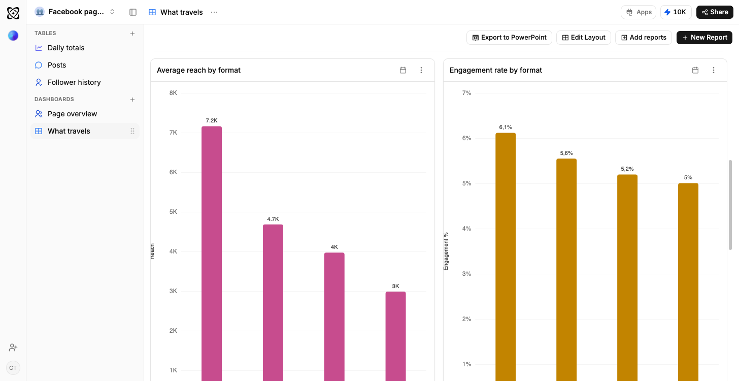
Every spike arrives with its post
Daily page reach is a line with the posts published on each day listed beside their peak, so a good day comes with the reason attached.
How a dashboard gets builtReactions are not shares
Reach, reactions and shares are held per post type with the ratio between them: where a post that collects reactions and never travels becomes obvious.
Typed columns, explainedGrowing, or being replaced
Net change on the audience row can be negative, and in the sample data it is, so the slow story is visible instead of averaged away.
Why a column has a type