

LinkedIn analytics template
Company page posts, impressions and follower growth, with a read on which topics actually get engagement.
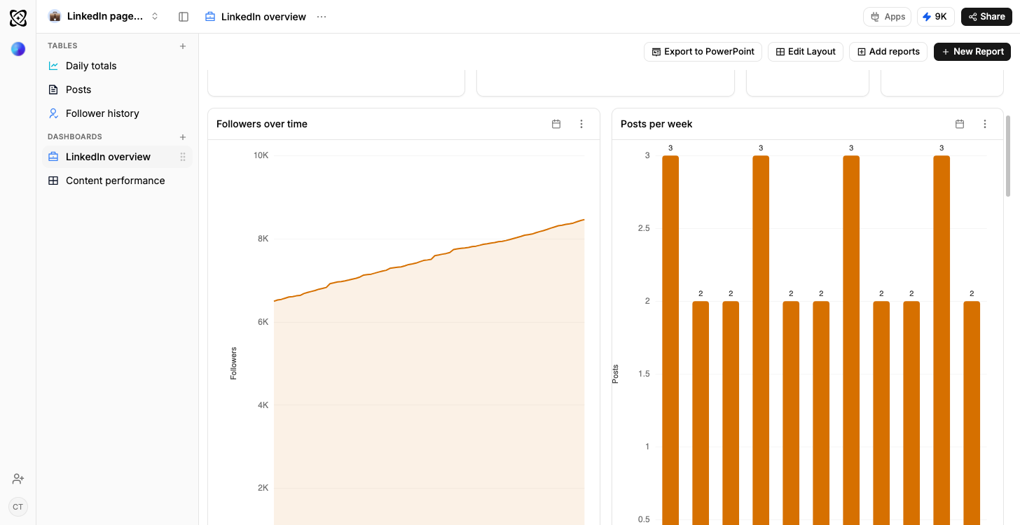
- Typed columns, not text
- Dates, numbers, percentages and selects, so a chart draws straight off the rows.
- Sample rows on arrival
- Every table opens with data in it, so the dashboards draw before yours does.
- Your own data, imported
- CSV, XLSX, a connected Google Sheet, or an email you forward straight in.
- Reshaped by describing it
- Say what is different and Ferra changes the structure and the rows together.
What is a LinkedIn analytics template?
Who actually turns up to your company page: that's what this workspace answers. Ferra's version holds the posts, the daily page metrics, and the follower and visitor snapshots in four tables with sample rows already in them, keeps history past LinkedIn's own window, and opens on two dashboards: impressions and engagement over time, and what your audience turns up for.
A company page succeeds or fails on whether the right job titles engage, not on raw impressions, and that is exactly the cut LinkedIn makes hardest to keep. This template stores posts with their format and performance, daily page metrics so the trend survives, and follower and visitor snapshots with the industry and seniority breakdown attached. What you get is the ability to say which kind of post reaches operations managers, rather than which post reached the most people.
What the four tables hold
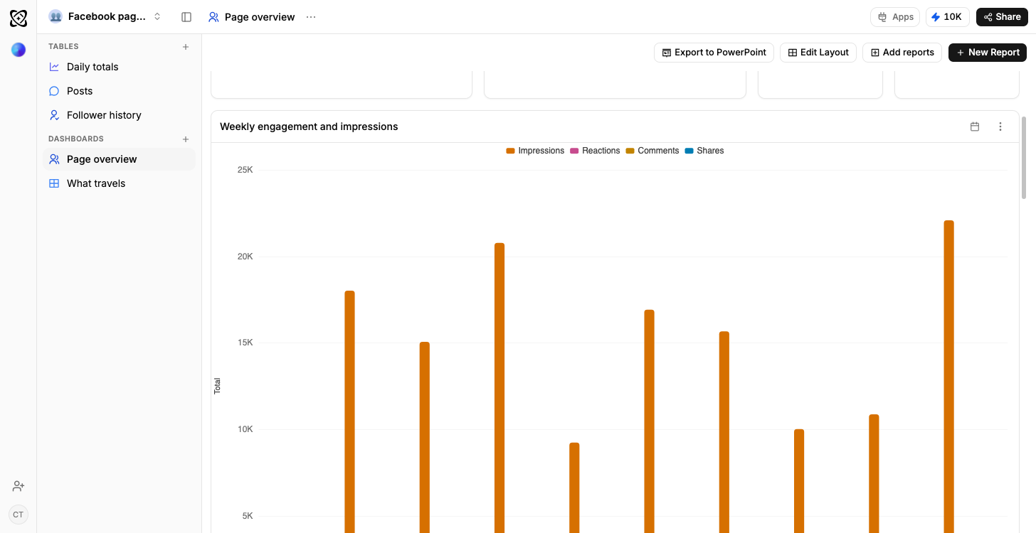
Posts comes first: one row per post from the company page, with the post itself, the date, the format. Document, Video, Text: the impressions it earned, the reactions it collected and an engagement rate as a percentage. Daily page metrics is one row per day of page-level performance: impressions, clicks, engagements, and the rate between them. Followers snapshots the audience on a date: total followers, how many were new, whether they arrived organically, and the top industry among them. Visitors does the same for the people who didn't follow: page views, unique visitors, and the top job function and top seniority on that date.
Impressions are the easy number to misread
Impressions from the wrong industry flatter the chart and change nothing. A company page succeeds or fails on whether the right job titles engage, and that's precisely the cut LinkedIn makes hardest to keep hold of. So the breakdown is stored beside the totals: top industry on every Followers row, top function and top seniority on every Visitors row, all of it dated. Your audience's composition turns into a line you watch move across a quarter, not a single figure somebody screenshots at the end of the month.
From describing last month to deciding next month
"This post did well" describes last month. "Document posts reach operations managers and video does not" decides next month: it's an instruction about what to write, not a recap. The route from the first sentence to the second is keeping format, impressions, reactions and engagement rate on the same row, so any comparison between two posts is like for like rather than one number held against another that was measured differently.
The two dashboards
Go quiet for a fortnight and the first dashboard hands you the bill. Impressions and engagement over time plots both together with posting dates marked, so a silent stretch shows up as the dip it caused rather than a gap nobody accounts for. What your audience turns up for crosses engagement by format with the industries and job functions of the people actually following you: the report built to decide the next post, not describe the last one.
Questions worth asking a company page
"Which posts got the most impressions per follower" is a fairer ranking than impressions alone will ever give you. "What kind of post gets engagement from operations people" is the question the visitor and follower breakdowns exist to answer. "How did follower growth track against how often we posted" needs both tables and a date. And the quiet budget-maker: "which weeks did we post nothing, and what did that do to reach": run it before your next content budget conversation.
Adding topics
Format explains half of why a post works. The subject explains the rest, and it isn't a column until you make it one. Add a Topics table, tag every post, and "what should we write about" gets an answer with numbers behind it rather than a preference expressed loudly in a meeting. An author column, a campaign, or a call-to-action type goes in the same way: the structure changes with the posts already in it.
Who it suits
A B2B marketer who owns the company page lives here. So does an agency reporting on one for a client, and a founder posting on behalf of the business. If Instagram, TikTok or Facebook run alongside it, the cross-platform social media analytics template puts them all on one set of axes instead.
Getting the data in
Imports do the work here: there's no live feed to babysit. Where your workspace has Ferra's social import enabled, you re-run it for fresh LinkedIn rows instead of leaving a connection open; where it isn't, LinkedIn's own export or a Google Sheet you already keep reads into the same tables, and that route works today. Once a month is cadence enough to keep the daily, follower and visitor tables current.
You may also like
Browse all templates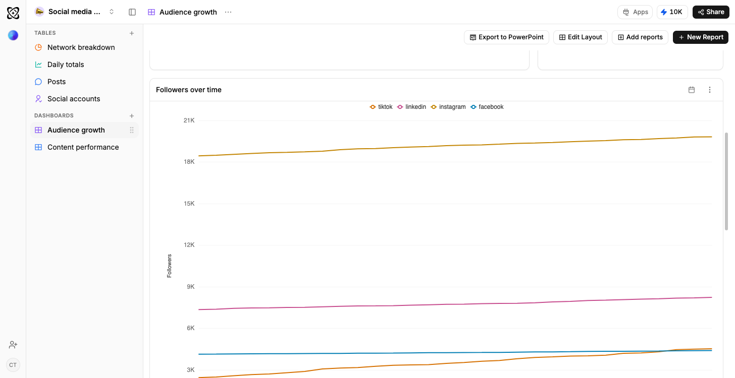
- TikTok
- YouTube
Social media analytics
Every channel compared, and what works where
Sales pipeline
Open pipeline by stage, results by owner
Real estate
Portfolio value and leads, by stage
Recruiting
Candidates by stage, openings by status
Client work
Due this week; shipped but not billed




Frequently asked questions
The questions people ask before starting from the LinkedIn page analytics template.
Through Ferra’s social import, where your workspace has it enabled: re-runnable rather than a live feed. Otherwise LinkedIn’s own export or a connected Google Sheet reads into these tables, and that works today.
Yes. The Visitors table carries top function and top seniority per day and the Followers table carries top industry, so the breakdown sits beside the totals.
It is built for a company page. The same four tables will hold a personal profile’s export, but the fields LinkedIn gives you are not identical.
Add a Topics table and tag every post, and what to write about becomes a question with numbers behind it.
Find out which posts reach the job titles you are writing for.
Posts keep their format and their performance and the page metrics keep accruing daily, so a quiet fortnight shows up as the dip it caused.
Use template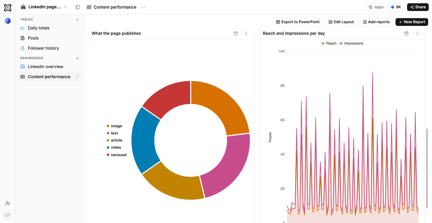
Which job titles actually turned up
Visitors carries top function and seniority per day and followers carries top industry, so reach can be read by who it reached.
Typed columns, explainedA quiet fortnight, visible as the dip
Page impressions and engagement rate are plotted with your posting dates marked, so the weeks you went silent show up as what they cost.
How a dashboard gets builtDocument, video, text: ranked
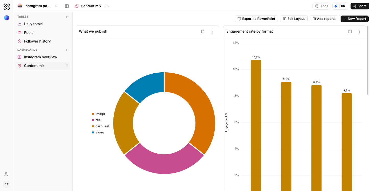
Format is a typed column on the post row, so the three rank against each other instead of blurring into one impressions total.
Why a column has a type