
- TikTok

TikTok analytics template
Videos, views, watch time and follower growth, with a dashboard for which formats hold attention to the end.
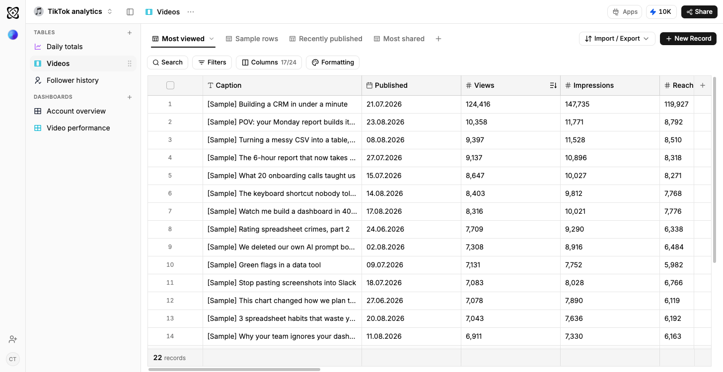
- Typed columns, not text
- Dates, numbers, percentages and selects, so a chart draws straight off the rows.
- Sample rows on arrival
- Every table opens with data in it, so the dashboards draw before yours does.
- Your own data, imported
- CSV, XLSX, a connected Google Sheet, or an email you forward straight in.
- Reshaped by describing it
- Say what is different and Ferra changes the structure and the rows together.
What is a TikTok analytics template?
Before you've loaded a single export, both dashboards are already drawing, watch time and completion, and growth against posting, powered by the sample rows in the template's four tables. Those tables hold your videos, your daily performance, your audience growth, and the sounds behind your best-performing posts.
Views are the number TikTok shows you and completion is the number that explains them. This template stores both per video, along with length and average watch time, so the relationship between how long a video is and how much of it people actually watch is something you can chart rather than sense. Sounds get their own table because a sound is a variable you can reuse, and once videos link to one, your best-performing audio stops being a thing you remember.
What the four tables hold
Videos carries the pair that explains everything else, the length in seconds and the completion rate, on the same row as the caption, the date it was posted, the views and the average watch time. Daily performance logs the account day by day: views, profile views, likes, comments, shares. Audience is one row per follower snapshot, with the count, the net change, the top territory and the top age band on that date. Sounds gets one row per audio track: how many videos used it, their average views, whether it's rising or fading, and when you first used it.
Views are the headline; completion is the explanation
Is the thirty-second cut worth the extra shooting day? A real answer exists once length and completion rate sit in the same table and can be plotted against each other, for your account, not for accounts in general. Views are the number TikTok shows you; completion is the number that explains them, and neither means much alone. Storing both per video, next to length and average watch time, makes the relationship chartable rather than merely sensed.
Why sounds get their own table
You can't reuse a caption. You can reuse a sound, which makes audio the one creative variable you get to deploy deliberately a second time. Each track gets its own row: a count of the videos that used it, their average views, and whether it's still rising, so your best-performing audio becomes something you look up rather than half-remember. Repeat what worked on purpose; don't wait to stumble across it again.
The two dashboards
Watch time and completion plots completion rate against video length with average watch time on the same chart, so the length that holds attention on your account is visible rather than assumed. Growth against posting lays net follower change per day over your posting frequency: the only way to compare the week you posted daily with the week you didn't. Both draw on the sample rows the workspace opens with.
Questions you can type
"Which videos hold attention past thirty seconds" reads length against average watch time. "Does length correlate with completion rate for us" is the question every posting guide answers on your behalf and nobody answers with your numbers. "Which sounds carried our best-performing videos" is a straight read of the Sounds table. And "what happened to follower growth in the week we posted every day" joins the audience snapshots to the posting dates.
Tagging the hook
The first two seconds decide whether anyone stays, and the thing doing the deciding, your opening line, isn't a column anywhere by default. Make it one. Add a Hooks table, tag each video's opening, and "which openings keep people watching" turns from instinct into a ranking. A creator column, a series, or a call to action goes in the same way, and the videos already logged come along with the change.
Who it suits
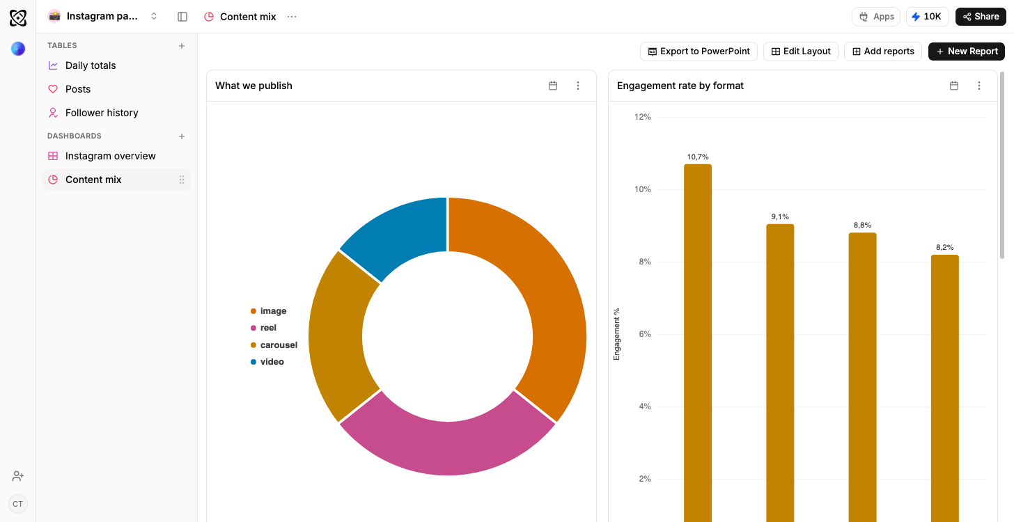
Creators running their own accounts are the obvious fit. A brand posting short video seriously gets just as much from it; so does an agency reporting to a client on one. When TikTok is one of several channels in a monthly report, the cross-platform social media analytics template is the better home. It plots every channel on one set of axes.
Getting the data in
Plan on imports, not a live pipe. Ferra's social import, on workspaces where it's enabled, pulls TikTok in and re-runs on demand; anywhere else, TikTok's own export or a Google Sheet you already keep loads the same tables, and it works today. TikTok Ads sits outside all of this: there's no Ferra connector to the ad platform, so spend isn't part of the template. A regular refresh keeps the daily and audience rows current, and video rows get added as you post.
You may also like
Browse all templates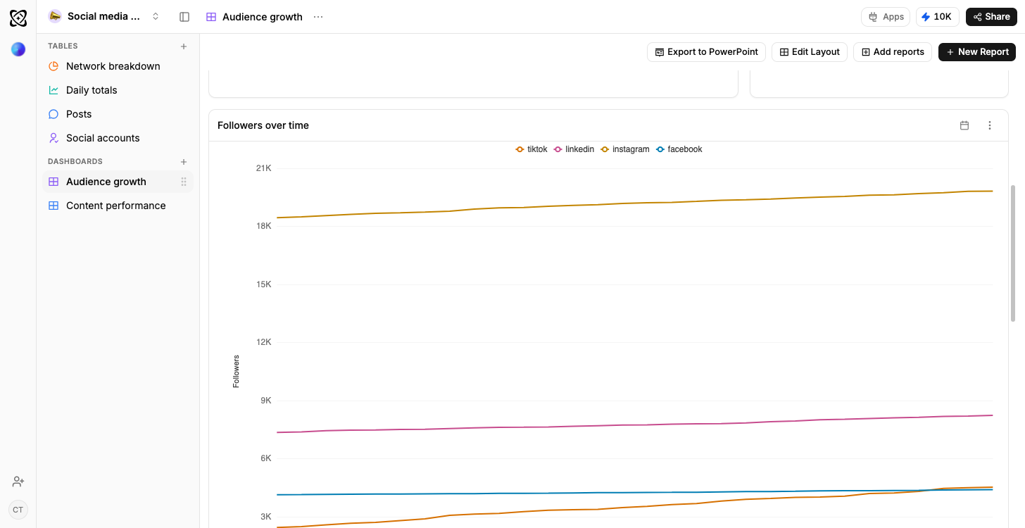
- TikTok
- YouTube
Social media analytics
Every channel compared, and what works where
Sales pipeline
Open pipeline by stage, results by owner
Real estate
Portfolio value and leads, by stage
Recruiting
Candidates by stage, openings by status
Client work
Due this week; shipped but not billed




Frequently asked questions
The questions people ask before starting from the TikTok analytics template.
Through Ferra’s social import, where your workspace has it enabled: re-runnable rather than a live feed. TikTok Ads is separate and has no connector. Otherwise TikTok’s own export or a connected Google Sheet reads into these tables.
Views tell you how far a video travelled; completion tells you whether it held anyone. Stored together with length and average watch time, they explain each other.
Sounds is one of the four tables. Each row carries the number of videos that used the track, their average views and whether it is rising.
Add a Hooks table and tag each video’s opening line, and which openings keep people watching becomes a ranking rather than an instinct.
Find out which cuts hold attention all the way to the end.
Completion against video length is a chart here, so whether the thirty-second cut earns the extra shooting day has an answer.
Use template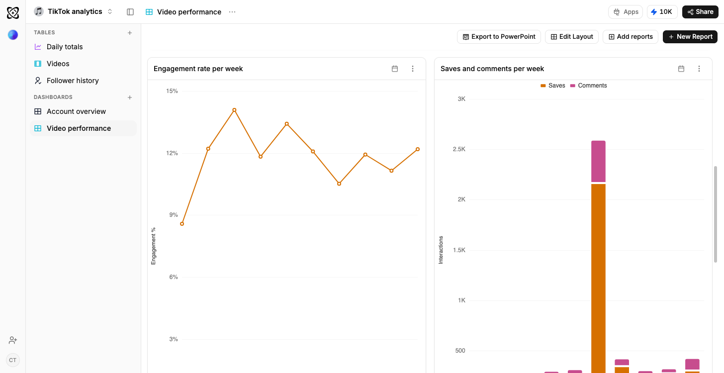
Length against how much gets watched
Completion and average watch time sit on the video row beside its length, so the thirty-second cut can be argued with a chart.
Typed columns, explainedYour best audio stops being a memory
Sounds is its own table, counting the videos that used each track and their average views, because a sound is a variable you can reuse.
How a derived column stays filledThe week you posted daily, compared
Net follower change per day is plotted with posting frequency behind it, so two weeks of very different effort are actually comparable.
How a dashboard gets built